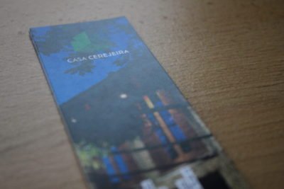
Visual identity work for “Casa Cerejeira” which is Local Accommodation property. It is composed by three independent guesthouses that are on the same site: Casa Celeiro, Casa Glicínia, Casa Rola.
At the briefing I retained that the philosophy was to merge the outer involving natural with the interior design of the guesthouses. It got me to the structure of the logo that through its optical illusion — sometimes it seems you are outside the cube, on others, it is if you are watching directly inside. This represents both — inner and outer spaces, that are merged into the same icon but there is more. If we dissemble its three they give us the three logos of each guesthouse that together form the main logo.
For the typographic solution I felt back to early references of the property where I found some old signage that date back back to the 1920s. I redraw a typeface that remits us to this universe but still has a contemporary twist.

![]()